mozgi
Seedance 2.0
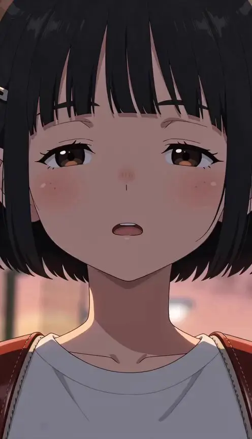
十秒鐘的動漫動態圖像,由四個垂直畫格組成,分別套用橙、黃、藍、綠色調
提示詞
提示詞:
一段日本全彩動漫,沒有字幕、沒有背景音樂、快速剪輯、高影格數,24 FPS。

使用「アット」imageA 作為起始影格和主要版面參考。
「アット」imageA 僅用於開場構圖、四格直向分割版面,以及最後如海報般的排列。
使用「アット」imageB 作為第一格的內容參考。
使用「アット」imageC 作為第二格的內容參考。
使用「アット」imageD 作為第三格的內容參考。
使用「アット」imageE 作為第四格的內容參考。
保留每張圖片原有的臉部結構、眼睛形狀、髮型輪廓、線條質感、漫畫紋理、拼貼紋理,以及圖像切割分格的感覺。

目標:
製作一段 10 秒、480p、動漫風格的動態圖像影片,畫面比例為 16:9。
影片以「アット」imageA 作為開場畫面。
畫面版面採用四欄直向分格構圖。
以「アット」imageA 開場後,從左至右逐格重新呈現各分格,並加入俐落的快門卡片插入效果。
分格內容順序必須嚴格如下:
左側分格 = 「アット」imageB,套用橘色調色
第二格 = 「アット」imageC,套用黃色調色
第三格 = 「アット」imageD,套用藍色調色
右側分格 = 「アット」imageE,套用綠色調色

0-0.8s:
直接以全螢幕播放「アット」imageA。
第一個影格應明顯呈現「アット」imageA 的樣貌。
以 16:9 畫面呈現已排列好的四格高直向分格版面。
加入細微的推近、淡淡的光暈、輕微的顆粒感,以及些許掃描線紋理。
不要文字、字幕或標誌。

0.8-1.3s:
一道俐落的快門閃光掠過畫面。
分格內容重設為深色或中性色的佔位格,同時保留四欄版面。
完整保留「アット」imageA 的整體分割畫面結構。

1.3-3.0s:
最左側分格率先啟動。
「アット」imageB 從左側邊緣滑入,並固定在最左欄。
套用強烈的橘色調色。
動作應呈現圖像卡片插入定位的感覺,而非淡入。
朝眼睛方向加入細微的推近。

3.0-4.7s:
第二格啟動。
「アット」imageC 從左側滑入,並固定在第二欄。
套用鮮明的黃色調色。
保留碎片化的人臉分格感。
加入輕微的分層視差效果和些許向下漂移。

4.7-6.5s:
第三格啟動。
「アット」imageD 從左側滑入,並固定在第三欄。
套用深藍色調色。
保留單色漫畫紋理和紙張顆粒感。
使用緩慢的推進鏡頭,並維持抽象拼貼的感覺。

6.5-8.2s:
第四格啟動。
「アット」imageE 從左側滑入,並固定在最右欄。
套用濃郁的綠色調色。
保留姿勢、勝利手勢、波波頭、柔和的表情、粗糙的墨線紋理,以及幾何拼貼背景。
A Japanese full-color anime with no captions, no background music, rapid-fire editing, a high frame count, and 24 FPS.

Use 「アット」imageA as the start frame and master layout reference.
Use 「アット」imageA only for the opening composition, the four-panel vertical split layout, and the final poster-like arrangement.
Use 「アット」imageB as the first panel content reference.
Use 「アット」imageC as the second panel content reference.
Use 「アット」imageD as the third panel content reference.
Use 「アット」imageE as the fourth panel content reference.
Preserve the original face structure, eye shape, hair silhouette, line quality, manga texture, collage texture, and graphic sliced-panel feeling of each image.

Goal:
Create a 10-second 480p anime-style motion graphic video in 16:9.
The video begins from 「アット」imageA as the opening frame.
The screen layout is a four-column vertical panel composition.
After starting from 「アット」imageA, the panels are reintroduced one by one from left to right with a crisp shutter-card insertion effect.
The panel content order must be strictly:
left panel = 「アット」imageB with orange color grading
second panel = 「アット」imageC with yellow color grading
third panel = 「アット」imageD with blue color grading
right panel = 「アット」imageE with green color grading

0-0.8s:
Start directly from 「アット」imageA full screen.
The first frame should clearly resemble 「アット」imageA.
Show the four tall vertical panel layout already arranged in 16:9.
Add a subtle push-in, faint glow, light grain, and slight scanline texture.
No text, no subtitles, no logos.

0.8-1.3s:
A sharp shutter blink passes across the frame.
The panel contents reset into dark or neutral placeholder slots while the four-column layout remains visible.
Keep the overall split-screen structure from 「アット」imageA intact.

1.3-3.0s:
The far-left panel activates first.
「アット」imageB slides in from the left edge and locks into the far-left column.
Apply strong orange color grading.
The motion should feel like a graphic card being inserted into place, not a fade.
Use a subtle push-in toward the eyes.

3.0-4.7s:
The second panel activates.
「アット」imageC slides in from the left and locks into the second column.
Apply vivid yellow color grading.
Keep the fragmented face-panel feeling.
Add a slight layered parallax effect and a tiny downward drift.

4.7-6.5s:
The third panel activates.
「アット」imageD slides in from the left and locks into the third column.
Apply deep blue color grading.
Preserve the monochrome manga texture and paper grain.
Use a slow dolly-in and keep the abstract collage feeling.

6.5-8.2s:
The fourth panel activates.
「アット」imageE slides in from the left and locks into the far-right column.
Apply rich green color grading.
Preserve the pose, peace sign, bob haircut, soft expression, rough ink texture, and geometric collage background.
- 提示詞為日文:直接貼上即可,模型能理解。
此提示詞的權利屬於作者 @Toshi_nyaruo_AI。任何商業使用(推廣 AI 工具、聚合平台、Telegram 機器人)由你自行負責,mozgi.io 不承擔任何責任。 詳情 →