mozgi
GPT Image 2.0
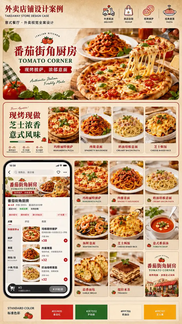
義大利外送品牌展示板,包含披薩、義大利麵、圖標與手機應用程式模型
提示詞
目標:為一家西式外送餐飲店面建立精緻的直式視覺識別展示板,聚焦於名為 番茄街角厨房、英文副標題為 TOMATO CORNER 的義大利披薩與義大利麵餐廳品牌。

畫布:2:3 比例的高挑直式海報,帶有細微紙張紋理的溫暖羊皮紙米色背景,細紅色分隔線,圓角奶油色內容卡片,高級餐飲外送品牌提案風格。

標題:左上方放置大型深紅色中文標題文字 外卖店铺设计案例,搭配較小的英文副標題 “TAKEAWAY STORE DESIGN CASE”,以及描述義大利餐廳外送視覺設計的較小中文文字。在右上方顯示恰好 4 個服務/分類圖示與雙語標籤:1) 機車外送,“外卖配送 / DELIVERY”;2) 購物袋到店取貨,“到店自取 / PICKUP”;3) 披薩圖示,“现烤披萨 / PIZZA”;4) 義大利麵盤圖示,“经典意面 / PASTA”。

主視覺區:製作一個佔據上方三分之一的大型圓角矩形橫幅。使用令人垂涎的寫實義大利料理攝影:前景是一個瑪格麗特披薩,叉子提起融化的起司,拉出長長的牽絲,表面放有小番茄與羅勒葉,後方是肉醬義大利麵,溫暖的餐廳燈光,前景以番茄與羅勒葉作為道具,左側放置綠色格紋布。左側疊加一個奶油色標籤面板,包含小型圓形番茄標誌與 “ITALIAN KITCHEN” 文字;加入大型紅色中文品牌名稱、綠色英文品牌名稱、寫有 现烤披萨,浓郁意面 的紅色緞帶標語,以及手寫英文文字 “Authentic Italian / Freshly Made”。

中段促銷橫條:在主視覺下方製作一張寬幅圓角卡片。左側放置大型堆疊中文促銷文案 “现烤现做 / 芝士浓香 / 意式风味”,搭配小型 “Buon Appetito!” 手寫註記、裝飾性番茄圖示,以及恰好 3 個標示為 “新鲜食材 / FRESH INGREDIENT”、“手工现做 / MADE TO ORDER” 和 “热力抢鲜 / HOT & FRESH” 的小型特色圖示。此橫條右側放置恰好 4 張直式商品卡片,搭配食物照片與雙語名稱:1) 瑪格麗特披薩,“玛格丽特披萨 / MARGHERITA PIZZA”;2) 肉醬義大利麵,“肉酱意面 / SPAGHETTI BOLOGNESE”;3) 奶油培根義大利麵,“奶油培根意面 / CREAMY BACON PASTA”;4) 起司焗飯,“芝士焗饭 / CHEESE BAKED RICE”。

下方版面:將下半部切分為左側的智慧型手機模型與右側的商品網格。智慧型手機為黑色 iPhone 風格外送 App 畫面,展示同一家餐廳店面:橫幅圖片、品牌名稱、4.8 評分、月銷量與配送時間資訊、分類分頁、帶有品項縮圖的菜單清單、紅色新增按鈕、例如 ¥38 與 ¥32 的價格,以及深色底部購物車列。保持 UI 真實、資訊豐富,同時清晰易讀。

商品網格:在手機右側製作恰好 9 張方形菜單卡片,排列為 3×3 網格,每張包含食物照片、小型番茄圖示、中文名稱與英文名稱。9 張卡片必須是:1) “玛格丽特披萨 / MARGHERITA PIZZA”;2) “肉酱意面 / SPAGHETTI BOLOGNESE”;3) “奶油培根意面 / CREAMY BACON PASTA”;4) “海鲜意面 / SEAFOOD PASTA”;5) “芝士焗饭 / CHEESE BAKED RICE”;6) “意式番茄汤 / TOMATO SOUP”;7) “蒜香面包 / GARLIC BREAD”;8) “提拉米苏 / TIRAMISU”;9) 一張品牌海報卡片,包含義大利街頭咖啡館插畫、番茄標誌、餐廳名稱、英文副標題與紅色標語。

頁尾:加入標示為 “STANDARD COLOR / 标准色彩” 的標準色彩列,搭配番茄插畫與恰好 4 個色票:1) 番茄紅 “#E53935 番茄红”;2) 羅勒綠 “#2E7D32 罗勒绿”;3) 奶油白 “#FFF7E6 奶油白”;4) 起司黃 “#FFC107 芝士黄”。

視覺風格:高級中國設計案例展示,簡潔的商業版面,將寫實光澤感食物攝影與小型向量圖示混合,營造溫暖的義大利小餐館氛圍,以番茄紅與羅勒綠作為點綴,奶油色卡片背景,柔和陰影,圓角,清晰的字體設計,不要浮水印,不要超出指定數量的額外區塊。
Goal: Create a polished vertical visual identity presentation board for a Western food delivery storefront, focused on an Italian pizza and pasta restaurant brand named 番茄街角厨房 with the English subtitle TOMATO CORNER.

Canvas: Tall portrait poster, 2:3 ratio, warm parchment beige background with subtle paper texture, thin red divider lines, rounded cream content cards, premium food-delivery brand proposal style.

Header: At the top left, large dark red Chinese headline text reading 外卖店铺设计案例, with smaller English subtitle “TAKEAWAY STORE DESIGN CASE” and a smaller Chinese line describing Italian restaurant takeaway visual design. Across the top right, show exactly 4 service/category icons with bilingual labels: 1) scooter delivery, “外卖配送 / DELIVERY”; 2) shopping bag pickup, “到店自取 / PICKUP”; 3) pizza icon, “现烤披萨 / PIZZA”; 4) pasta plate icon, “经典意面 / PASTA”.

Hero section: A large rounded rectangular banner occupying the upper third. Use appetizing photorealistic Italian food photography: a margherita pizza in the foreground with melted cheese being lifted in long strands by a fork, cherry tomatoes and basil leaves on top, spaghetti bolognese behind it, warm restaurant lighting, tomatoes and basil leaves as foreground props, green gingham cloth on the left. Overlay a cream label panel on the left with a small circular tomato logo and “ITALIAN KITCHEN”; large red Chinese brand name, green English brand name, a red ribbon tagline reading 现烤披萨,浓郁意面, and handwritten English text “Authentic Italian / Freshly Made”.

Middle promotional strip: Under the hero, create one wide rounded card. On the left, large stacked Chinese promotional copy “现烤现做 / 芝士浓香 / 意式风味”, with a small “Buon Appetito!” script note, decorative tomato icon, and exactly 3 small feature icons labeled “新鲜食材 / FRESH INGREDIENT”, “手工现做 / MADE TO ORDER”, and “热力抢鲜 / HOT & FRESH”. On the right of this strip, place exactly 4 vertical product cards with food photos and bilingual names: 1) Margherita pizza, “玛格丽特披萨 / MARGHERITA PIZZA”; 2) spaghetti bolognese, “肉酱意面 / SPAGHETTI BOLOGNESE”; 3) creamy bacon pasta, “奶油培根意面 / CREAMY BACON PASTA”; 4) cheese baked rice, “芝士焗饭 / CHEESE BAKED RICE”.

Lower layout: Split the lower half into a smartphone mockup on the left and a product grid on the right. The smartphone is a black iPhone-style delivery app screen showing the same restaurant storefront: banner image, brand name, rating 4.8, monthly sales and delivery time details, category tabs, menu list with item thumbnails, red add buttons, prices such as ¥38 and ¥32, and a dark bottom cart bar. Keep the UI realistic and dense but legible.

Product grid: To the right of the phone, create exactly 9 square menu cards in a 3 by 3 grid, each with a food photo, small tomato icon, Chinese name, and English name. The 9 cards must be: 1) “玛格丽特披萨 / MARGHERITA PIZZA”; 2) “肉酱意面 / SPAGHETTI BOLOGNESE”; 3) “奶油培根意面 / CREAMY BACON PASTA”; 4) “海鲜意面 / SEAFOOD PASTA”; 5) “芝士焗饭 / CHEESE BAKED RICE”; 6) “意式番茄汤 / TOMATO SOUP”; 7) “蒜香面包 / GARLIC BREAD”; 8) “提拉米苏 / TIRAMISU”; 9) a brand poster card with Italian street cafe illustration, tomato logo, restaurant name, English subtitle, and red slogan.

Footer: Add a standard color palette bar labeled “STANDARD COLOR / 标准色彩” with a tomato illustration and exactly 4 color swatches: 1) tomato red “#E53935 番茄红”; 2) basil green “#2E7D32 罗勒绿”; 3) cream white “#FFF7E6 奶油白”; 4) cheese yellow “#FFC107 芝士黄”.

Visual style: High-end Chinese design case presentation, clean commercial layout, realistic glossy food photography mixed with small vector icons, warm Italian trattoria mood, tomato-red and basil-green accents, cream card backgrounds, soft shadows, rounded corners, crisp typography, no watermark, no extra sections beyond the specified counts.
此提示詞的權利屬於作者 @MrLarus。任何商業使用(推廣 AI 工具、聚合平台、Telegram 機器人)由你自行負責,mozgi.io 不承擔任何責任。 詳情 →