mozgi
GPT Image 2.0
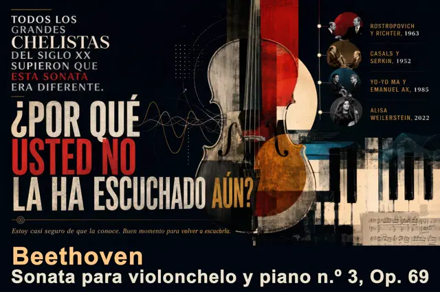
關於貝多芬奏鳴曲的戲劇性西班牙語海報,包含大提琴拼貼、時間軸與排版,GPT Image 2.0中生成
提示詞
目標:製作一張關於 Beethoven Sonata para violonchelo y piano n.º 3, Op. 69 的戲劇性西班牙文編輯風格海報,將其呈現為不可錯過的古典音樂探索。

畫布:寬幅水平 16:9 海報,深色近黑背景,復古音樂會節目單質感,略帶磨損的印刷顆粒,高對比度,優雅的博物館/展覽設計。

版面:左側由大型西班牙文排版主導;右側中央以高聳的大提琴拼貼為主;右下方放置鋼琴琴鍵與一小段手寫樂譜;右上方放置由圓形照片徽章組成的知名演奏家垂直時間軸。使用層疊的幾何圖形、纖細的技術圖表線條、波形曲線、點狀網格,以及細微的音樂記譜細節。

主要文字內容:左上方設定白色堆疊式襯線標題,並加入一行紅色強調文字:“TODOS LOS GRANDES CHELISTAS DEL SIGLO XX SUPIERON QUE ESTA SONATA ERA DIFERENTE.” 將“ESTA SONATA”設為紅色。下方以巨大、窄體、帶磨損質感的區塊字體呈現問題:“¿POR QUÉ USTED NO LA HA ESCUCHADO AÚN?” 將“USTED NO”設為亮紅色,大多數其他文字使用米白色,“AÚN?” 使用赭金色。在問題下方加入一行暖米色的小型斜體句子:“Estoy casi seguro de que la conoce. Buen momento para volver a escucharla.” 底部以大型暖奶油色字體加入作曲家姓名:“Beethoven”,並在其下方以粗體白色文字加入:“Sonata para violonchelo y piano n.º 3, Op. 69”。

中央主體:一把大型直立式大提琴,從頂部到底部裁切,位於畫面中央略偏右。製作成混合媒材拼貼:逼真的木紋、黑色琴弦、清晰可見的琴橋與 f 孔、半透明疊加效果、貫穿琴身上半部的紅色垂直矩形、琥珀橙色的下琴身、位於其後方的米色月亮般圓形圓盤,以及磨損的紙張質感。大提琴應覆蓋從左側文字延伸至樂器的抽象聲波線條。

右側時間軸:加入恰好 4 個圓形演奏家徽章,以帶有小節點的纖細垂直線連接。標籤必須完全顯示為:1) “ROSTROPOVICH Y RICHTER, 1963”、2) “CASALS Y SERKIN, 1952”、3) “YO-YO MA Y EMANUEL AX, 1985”、4) “ALISA WEILERSTEIN, 2022”。在圓形內使用小型棕褐色或黑白音樂家肖像風格影像,姓名以赭色大寫字母呈現,年份使用淡奶油色。

視覺風格:精緻的古典音樂雜誌封面結合 Bauhaus 音樂會海報;深海軍藍黑色、象牙白、猩紅色、赭金色、低彩度藍綠色與棕褐色;磨損墨水、老紙、細微刮痕、微妙網點,以及層疊拼貼。字體應呈現大膽、西班牙、編輯風格與電影感,結合優雅的襯線文字和巨大的窄體無襯線展示字體。

限制:所有可見文字都必須完全依照指定內容使用西班牙文。不得加入標誌、水印、現代使用者介面元素或額外的演奏家項目。在復古粗獷質感之下仍須維持高度可讀性。
Goal: Create a dramatic Spanish editorial poster about Beethoven Sonata para violonchelo y piano n.º 3, Op. 69, presenting it as an essential classical music discovery.

Canvas: Wide horizontal 16:9 poster, dark near-black background, vintage concert-program texture, slightly distressed print grain, high contrast, elegant museum/exhibition design.

Layout: Left side dominated by large Spanish typography; center-right dominated by a tall cello collage; lower-right contains piano keys and a small handwritten sheet-music fragment; upper-right contains a vertical timeline of notable performers with circular photo medallions. Use layered geometric shapes, thin technical diagram lines, waveform curves, dotted grids, and subtle music-notation details.

Main text content: At upper left, set a stacked serif headline in white with one red emphasis line: “TODOS LOS GRANDES CHELISTAS DEL SIGLO XX SUPIERON QUE ESTA SONATA ERA DIFERENTE.” Make “ESTA SONATA” red. Below it, use huge condensed distressed block lettering for the question: “¿POR QUÉ USTED NO LA HA ESCUCHADO AÚN?” Make “USTED NO” bright red, most other words off-white, and “AÚN?” ochre-gold. Under the question, add a small italic sentence in warm beige: “Estoy casi seguro de que la conoce. Buen momento para volver a escucharla.” At the bottom, add the composer name in large warm cream: “Beethoven”, and beneath it in bold white: “Sonata para violonchelo y piano n.º 3, Op. 69”.

Central subject: A large upright cello, cropped from top to bottom, centered slightly right. Make it a mixed-media collage: realistic wood grain, black strings, visible bridge and f-holes, semi-transparent overlays, red vertical rectangle through the upper body, amber-orange lower bout, beige circular moon-like disk behind it, and worn paper textures. The cello should overlap abstract sound-wave lines that travel from the left typography toward the instrument.

Right timeline: Include exactly 4 circular performer medallions connected by a thin vertical line with small nodes. Labels must read exactly: 1) “ROSTROPOVICH Y RICHTER, 1963”, 2) “CASALS Y SERKIN, 1952”, 3) “YO-YO MA Y EMANUEL AX, 1985”, 4) “ALISA WEILERSTEIN, 2022”. Use small sepia or black-and-white portrait-style musician images inside the circles, with names in ochre uppercase and years in pale cream.

Visual style: Sophisticated classical-music magazine cover meets Bauhaus concert poster; dark navy-black, ivory, scarlet red, ochre gold, muted teal, and sepia; distressed ink, aged paper, fine scratches, subtle halftone, and layered collage. Typography should feel bold, Spanish, editorial, and cinematic, with a mix of elegant serif text and massive condensed sans-serif display type.

Constraints: Keep all visible text in Spanish exactly as specified. Do not add logos, watermarks, modern UI elements, or extra performer entries. Maintain strong readability despite the vintage grunge texture.
此提示詞的權利屬於作者 @jjarangoes。任何商業使用(推廣 AI 工具、聚合平台、Telegram 機器人)由你自行負責,mozgi.io 不承擔任何責任。 詳情 →