mozgi
GPT Image 2.0
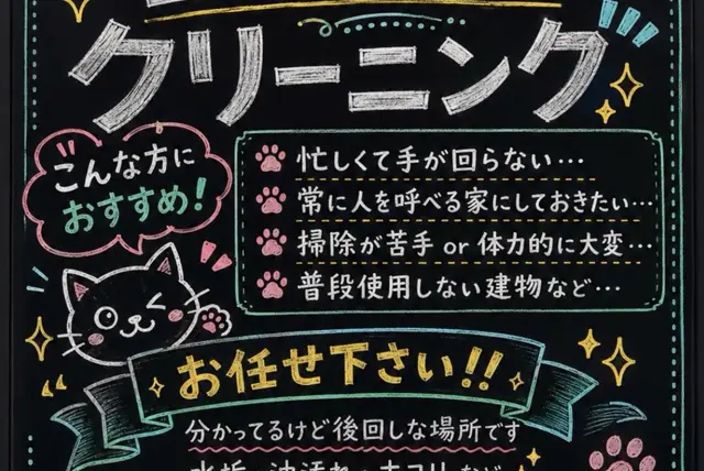
帶有粉筆字、可愛黑貓和服務清單的日本黑板招牌
提示詞
目標:建立一個以清潔服務為主題的手繪日式粉筆黑板招牌,呈現可愛、親切又有手作感的店面招牌風格。

畫布:3:2 長寬比的橫向黑板海報,深色霧面黑色背景,帶有清晰可見的粉筆質感;底部略微裁切,彷彿近距離拍攝而成。

版面:頂部橫跨一個以粗白色粉筆書寫的大標題: 「クリーニング」. 在標題周圍加入黃色、薄荷綠與藍色的小型裝飾粉筆線條、圓點、漩渦與閃光圖示。左側中段放置粉紅色對話框外框,內含白色文字 「こんな方に」 與薄荷綠文字 「おすすめ!」. 在對話框下方繪製一隻可愛的黑貓吉祥物,以白色粉筆勾勒輪廓;牠正在眨眼,具有圓臉頰、鬍鬚、三角形耳朵,以及一隻抬起、帶有粉紅色肉球的爪子。右側中段建立一個圓角矩形薄荷綠粉筆外框的資訊框。在其中列出剛好 4 個項目,每個項目前方都放置粉紅色肉球圖示:1) 「忙しくて手が回らない…」 2) 「常に人を呼べる家にしておきたい…」 3) 「掃除が苦手 or 体力的に大変…」 4) 「普段使用しない建物など…」. 使用黃色虛線分隔各項目列。在下方中央加入一個寬大的弧形緞帶橫幅,以藍綠色勾勒輪廓並填入黑色,搭配粗體黃色粉筆文字: 「お任せ下さい!!」. 緞帶下方加入較小的白色粉筆文字: 「分かってるけど後回しな場所です」 ,並加上粉紅色波浪底線。

視覺風格:日式 kawaii 粉筆藝術、粗獷的手寫字、不完美的筆觸、帶有粉塵感的粉筆暈痕、活潑但易讀的字體,以及黑色背景上白色、黃色、薄荷綠與粉紅色的高對比。使用裝飾性閃光、圓點、角落邊框、肉球圖案與短促的強調線,但要讓設計保持如專業店面招牌般整齊有序。

限制:恰好使用 1 隻貓吉祥物、1 個對話框、1 個主要資訊框、4 個肉球項目與 1 個緞帶橫幅。所有可見文字都必須完全按照指定內容以日文呈現。不得使用寫實物件、數位光澤效果或浮水印。
Goal: Create a hand-drawn Japanese chalkboard sign advertising cleaning, with a cute, friendly, handmade storefront-board look.

Canvas: Horizontal blackboard poster in a 3:2 aspect ratio, dark matte black background with visible chalk texture, slightly cropped at the bottom as if photographed close-up.

Layout: Large title across the top in thick white chalk: 「クリーニング」. Add small decorative chalk lines, dots, swirls, and sparkle icons around the title in yellow, mint, and blue. On the left middle, place a pink speech-bubble outline containing the text 「こんな方に」 in white and 「おすすめ!」 in mint green. Beneath the bubble, draw one cute black cat mascot outlined in white chalk, winking, with round cheeks, whiskers, triangular ears, and one raised paw with pink paw pads. On the right middle, create one rectangular mint-green chalk outline information box with rounded corners. Inside it, list exactly 4 bullet points, each preceded by a pink paw-print icon: 1) 「忙しくて手が回らない…」 2) 「常に人を呼べる家にしておきたい…」 3) 「掃除が苦手 or 体力的に大変…」 4) 「普段使用しない建物など…」. Separate the bullet rows with dashed yellow divider lines. Across the lower center, add a wide curved ribbon banner in teal outline and black fill, with bold yellow chalk text: 「お任せ下さい!!」. Below the ribbon, include smaller white chalk text: 「分かってるけど後回しな場所です」 with a pink wavy underline.

Visual style: Japanese kawaii chalk art, rough hand-lettering, imperfect strokes, dusty chalk smudges, playful but readable typography, high contrast white/yellow/mint/pink on black. Use decorative sparkles, dots, corner borders, paw prints, and short emphasis marks, but keep the design organized like a professional shop sign.

Constraints: Use exactly 1 cat mascot, 1 speech bubble, 1 main information box, 4 paw-print bullet items, and 1 ribbon banner. Keep all visible text in Japanese exactly as specified. No photorealistic objects, no digital glossy effects, no watermark.
- 提示詞為日文:直接貼上即可,模型能理解。
此提示詞的權利屬於作者 @SenriX。任何商業使用(推廣 AI 工具、聚合平台、Telegram 機器人)由你自行負責,mozgi.io 不承擔任何責任。 詳情 →