mozgi
GPT Image 2.0
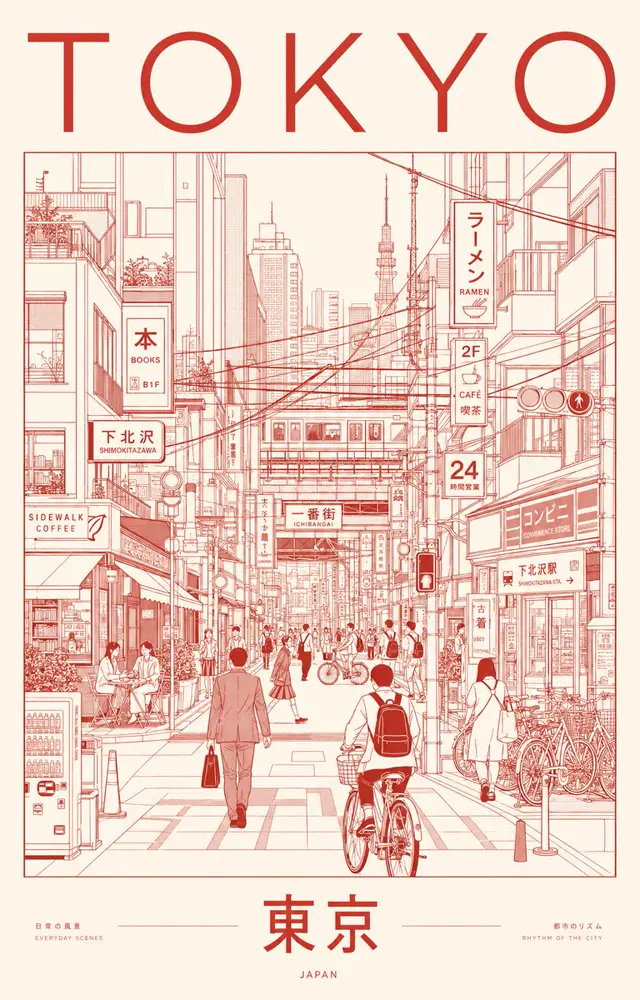
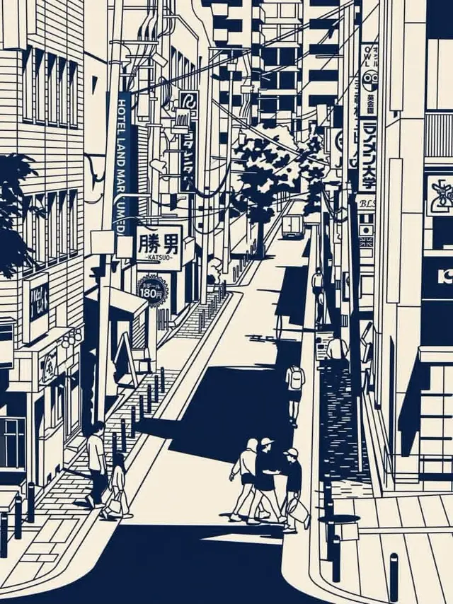
細緻的日本城市街道以極簡主義圖形風格呈現,深藍色墨水在背景中
提示詞
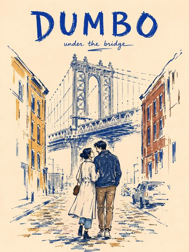
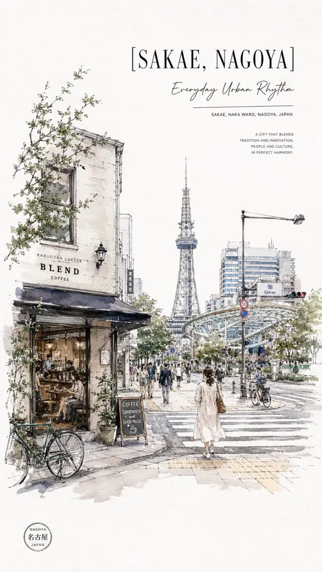
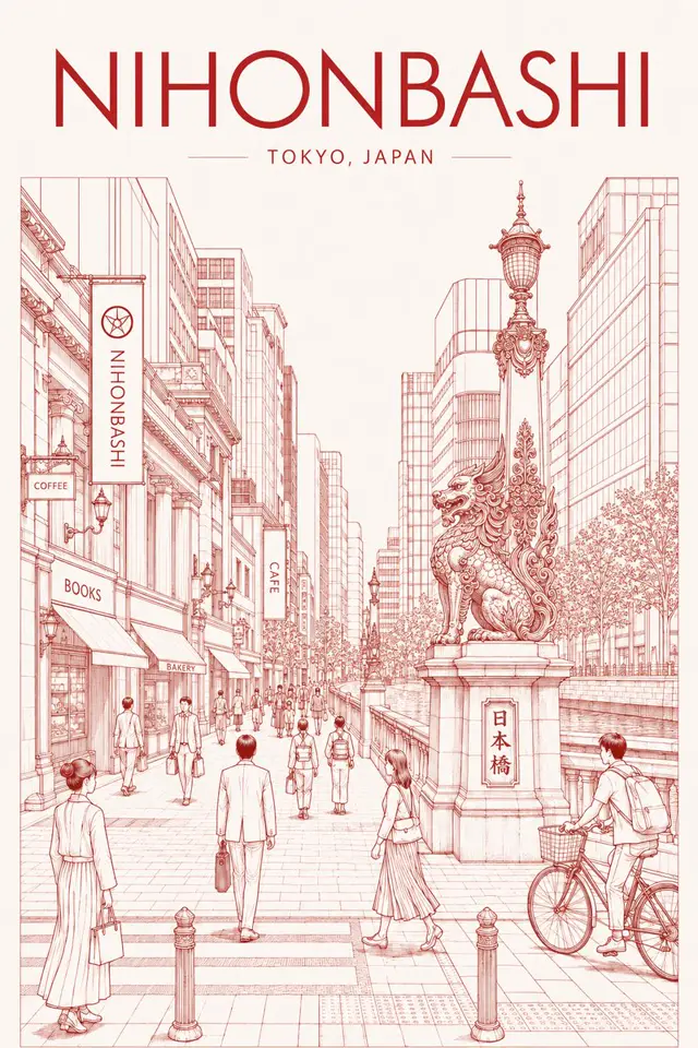
建立一幅直式編輯風格插畫,靈感來自參考圖片,以高度風格化的海軍藍與暖象牙白單色線稿美學,描繪一處密集的日本都市景觀。

描繪一條從高處俯瞰的狹窄日本城市街道,兩側排列著高聳而緊密相連的建築,並呈現層疊的店面、陽台、窗戶、懸掛招牌、日文字體、電線桿、交錯纏繞的架空電纜、路燈、遮雨棚、欄杆、自行車,以及細小的建築細節。街道應自然延伸至遠方,營造強烈的深度與透視感。

在場景中自然地加入幾位小巧的行人:有人提著袋子、查看手機、穿越街道,也有人成對步行。人物造型簡化但富有表現力,輪廓俐落,臉部細節簡潔。

所有輪廓、陰影、招牌、電纜、窗戶與建築細節皆使用深靛藍/海軍藍墨色,並與暖奶油色/米白色紙張背景形成對比。強烈的圖像化陰影與大面積實心海軍藍區塊,營造醒目的絹印海報效果。

第二個場景描繪一座日本鐵路車站月台,視角略高,從側面觀看。呈現細節豐富的鋼製屋頂結構、橫梁、電纜、上方指示牌、月台標線、磁磚地面、鐵軌、柱子、欄杆、售票區設施,以及幾位正在等候或邊走邊看手機的通勤者。維持相同的視覺語言:精準的建築線稿、簡化的人物、深海軍藍陰影、奶油色紙張與密集的都市細節。

風格:日本都市速寫本 + 建築墨線插畫 + 復古旅遊海報 + 絹印 + 漫畫風格的環境線稿,繁複的手繪細節、俐落的透視、醒目的負空間、略帶不完美感的墨水質地、精緻的編輯式構圖、懷舊的類比印刷質感。

色彩配置:僅使用深海軍藍、低彩度藍灰色與暖象牙白/奶油色。不要使用鮮豔色彩。

構圖:細節豐富、視覺密集,前景/中景/背景平衡,消失點明確,電影感取景,線條清晰,帶有細微紙張顆粒感,呈現高級藝術書插畫的質感。

長寬比:4:5 直式。
Create a vertical editorial illustration inspired by the reference images, depicting a dense Japanese urban scene in a highly stylized navy-blue and warm ivory monochrome line-art aesthetic.

Show a narrow Japanese city street viewed from an elevated perspective, with tall tightly packed buildings on both sides, layered storefronts, balconies, windows, hanging signs, Japanese typography, utility poles, tangled overhead power cables, street lamps, awnings, railings, bicycles, and small architectural details. The street should lead naturally into the distance, creating strong depth and perspective.

Include several small pedestrians naturally walking through the scene—people carrying bags, checking phones, crossing the street, and walking in pairs. Keep them simplified but expressive, with clean silhouettes and minimal facial detail.

Use deep indigo/navy ink for all outlines, shadows, signs, cables, windows, and architectural details, contrasted against a warm cream/off-white paper background. Strong graphic shadows and large solid navy areas should create a bold screen-print/poster effect.

For the second scene, depict a Japanese railway station platform from a slightly elevated side perspective. Show detailed steel roof structures, beams, electrical cables, overhead signage, platform markings, tiled flooring, railway tracks, columns, railings, ticket-area structures, and several commuters waiting or walking while looking at their phones. Preserve the same visual language: precise architectural linework, simplified human figures, deep navy shadows, cream paper, and dense urban detail.

Style: Japanese urban sketchbook + architectural ink illustration + vintage travel poster + screen printing + manga-inspired environmental linework, intricate hand-drawn details, clean perspective, bold negative space, slightly imperfect ink texture, sophisticated editorial composition, nostalgic analog print feel.

Color palette: only deep navy blue, muted blue-gray, and warm ivory/cream. No bright colors.

Composition: highly detailed, visually dense, balanced foreground/midground/background, strong vanishing points, cinematic framing, crisp linework, subtle paper grain, premium art-book illustration.

Aspect ratio: 4:5 vertical.
此提示詞的權利屬於作者 @Taaruk_。任何商業使用(推廣 AI 工具、聚合平台、Telegram 機器人)由你自行負責,mozgi.io 不承擔任何責任。 詳情 →