mozgi
Nano Banana Pro
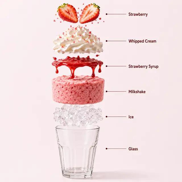
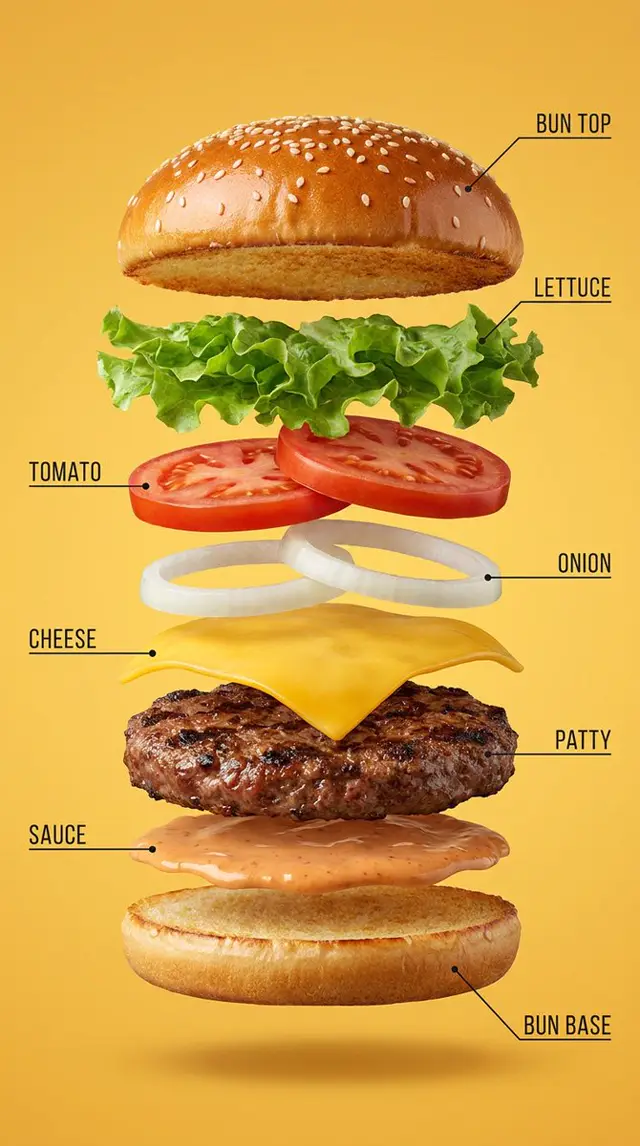
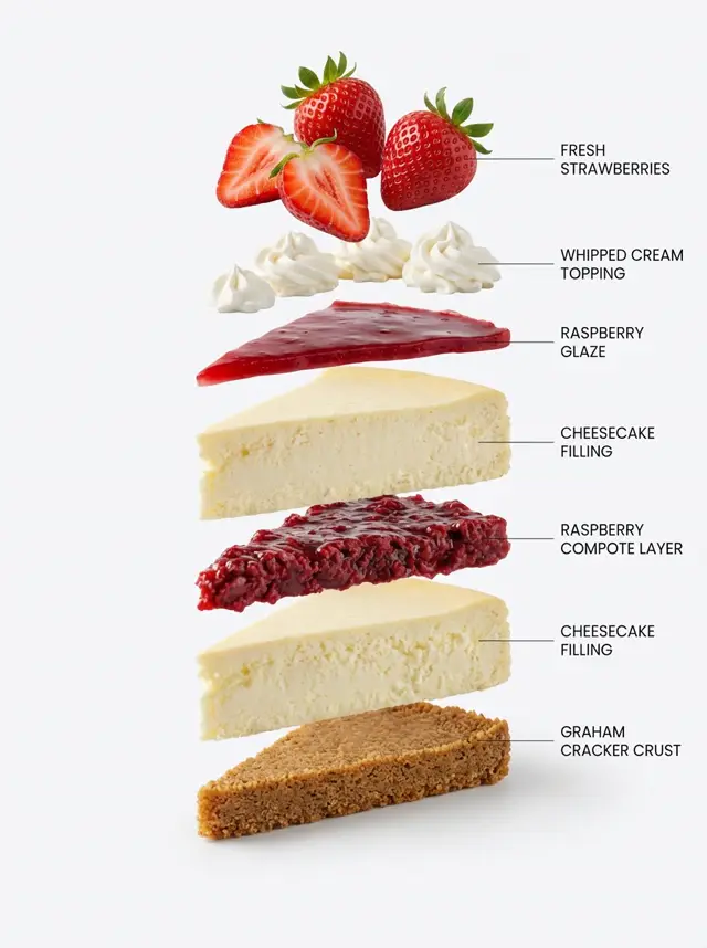
資訊圖表, 靜物, 寫實主義, 垂直, 產品
提示詞
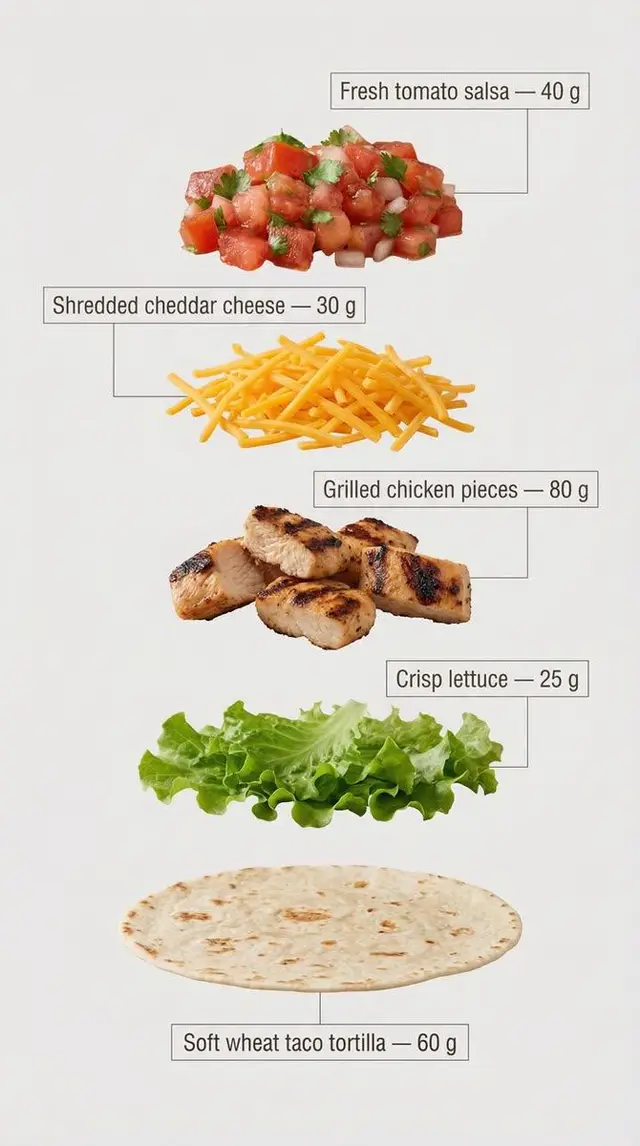
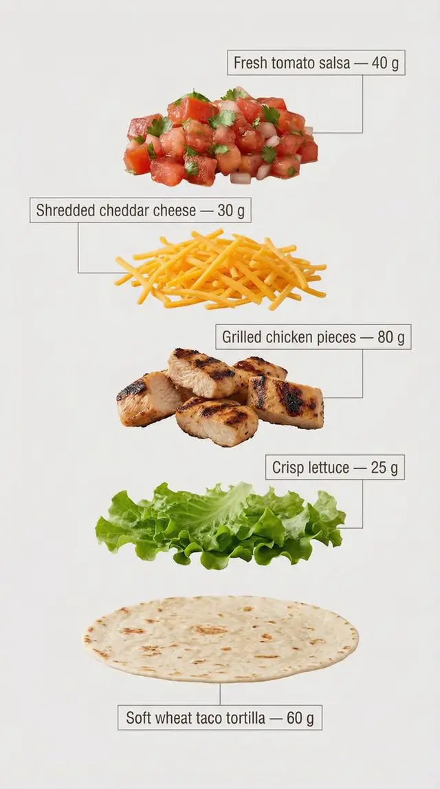
同一款塔可的爆炸圖,以乾淨、商業食譜風格呈現。
精確的五種食材,與第一張圖片相符,從上到下垂直分隔排列,間距均勻且完美對齊。

食材順序(上 → 下):

新鮮番茄莎莎醬 — 40 克

切絲切達起司 — 30 克

烤雞塊 — 80 克

脆生菜 — 25 克

軟質小麥塔可餅 — 60 克(底部基底)

為每種食材添加清晰的資訊圖表式註釋。
每項註釋包含食材名稱及其精確的克數重量,書寫方式與上方列表完全相同。

註釋設計指南:
– 乾淨的無襯線字體,中等粗細
– 文字放置在極簡框架或方框內
– 細緻、精確的連接線直接指向每種食材
– 高可讀性,無重疊,無裝飾性過多元素
– 結構化的垂直佈局,如同現代食譜卡

背景為淺色、中性,並針對文字清晰度和視覺潔淨度進行優化。
整體風格為極簡、教學式和商業化,適合行銷、解說視覺和產品分解圖。
Exploded view of the same taco, presented as a clean, commercial recipe-style breakdown.
Exactly five ingredients, matching the first image, separated and arranged vertically from top to bottom, evenly spaced and perfectly aligned.

Ingredient order (top → bottom):

Fresh tomato salsa — 40 g

Shredded cheddar cheese — 30 g

Grilled chicken pieces — 80 g

Crisp lettuce — 25 g

Soft wheat taco tortilla — 60 g (bottom base)

Add clear infographic-style annotations for each ingredient.
Each annotation includes the ingredient name and its exact weight in grams, written exactly as listed above.

Annotation design guidelines:
– Clean sans-serif font, medium weight
– Text placed inside minimal frames or boxes
– Thin, precise connector lines pointing directly to each ingredient
– High readability, no overlap, no decorative excess
– Structured vertical layout, like a modern recipe card

Background is light, neutral, and optimized for text clarity and visual cleanliness.
Overall style is minimal, instructional, and commercial, suitable for marketing, explainer visuals, and product breakdowns.
此提示詞的權利屬於作者 @Strength04_X。任何商業使用(推廣 AI 工具、聚合平台、Telegram 機器人)由你自行負責,mozgi.io 不承擔任何責任。 詳情 →